


Packaging
The Natasha Denona Need a Nude palette comes in a sleek and simple plastic packaging, a departure from her usual cardboard packaging. It has a magnetic closure, giving it a secure and luxe feel. Priced at $69, it is a bit on the higher side, but it does come with a thoughtful feature – little holes on the back where you can pop out the shades if you want to rearrange them. This customizable aspect adds a nice touch and is something I wish more brands would consider.
First Impressions
When I first laid eyes on the Need a Nude palette, I couldn’t help but question if I really needed yet another palette filled with nude and neutral shades. After all, my collection already boasts numerous palettes in this color range. However, the conflicting online photos piqued my curiosity. Some made the palette appear cool-toned, while others hinted at a warm-toned selection. Intrigued, I decided to explore this palette further and see what it had to offer.
The Shades
Now, let’s take a closer look at the shades within the Need a Nude palette. As expected, it features a range of nude and neutral tones, perfect for creating both everyday and glamorous looks. However, the true beauty of this palette lies in its balance. It is neither overwhelmingly cool-toned nor intensely warm-toned. Instead, it finds a delicate middle ground, offering versatility and adaptability.
Comparisons
To truly gauge the uniqueness of this palette, it is important to make some comparisons. While I have other nude and neutral palettes in my collection, each one brings its own twist to the table. The Need a Nude palette, with its harmonious blend of shades, sets itself apart from the rest. It offers a curated range that effortlessly transitions from day to night, making it a valuable addition to any makeup enthusiast’s collection.
Application
Now it’s time to put this palette to the test. Upon application, it quickly became evident that the formula of the shadows is exceptional. The pigmentation is rich, allowing for seamless blending and effortless build-up. The shades apply smoothly without any patchiness or fallout. From soft mattes to shimmery metallics, each texture within the palette performs flawlessly, enhancing the overall application experience.
The Shades
The Natasha Denona “I Need a Nude” palette boasts a total of 15 shades, with eight shimmers and seven mattes. Upon first glance, it seems to lean more towards the cool-toned spectrum. This could be attributed to the palette’s cool silver background. However, upon closer inspection, it becomes evident that there is indeed a balance of warm and cool shades.
Swatch Test
To truly understand the palette’s color story, let’s take a look at the swatches. Surprisingly, most of the shimmers actually lean towards the warmer side. This adds a touch of vibrancy and makes the palette more versatile.
The Warm and Cool Dichotomy
While there are warmer-leaning matte shades such as the peachy hue and various browns, there are also a few cool-toned taupe mattes as well as a dusty rose shade. This combination of warm and cool colors showcases the palette’s versatility and ensures that there’s something for everyone.
Comparison with the Glam Palette
To further gauge the uniqueness of the “I Need a Nude” palette, let’s compare it to Natasha Denona’s previous release, the Glam palette. The Glam palette, which is another neutral or nude option, has consistently been a favorite. However, upon initial observation, it appears deeper and smokier compared to the softer and more subtle “I Need a Nude” palette.
The Similarity in Warm and Cool Tones
Upon swatching both palettes, it becomes clear that the Glam palette also features a mix of warm and cool tones. This similarity assures buyers that even though the “I Need a Nude” palette may appear cooler at first glance, it is not drastically different from other neutral options in the market.
The “I Need a Nude” palette from Natasha Denona offers a well-balanced selection of shades with a mix of warm and cool tones. Its versatility and the range of shimmer and matte options allow for various eye looks to be created. Whether you’re a fan of cool or warm-toned eyeshadows, this palette contains something to cater to your preferences.
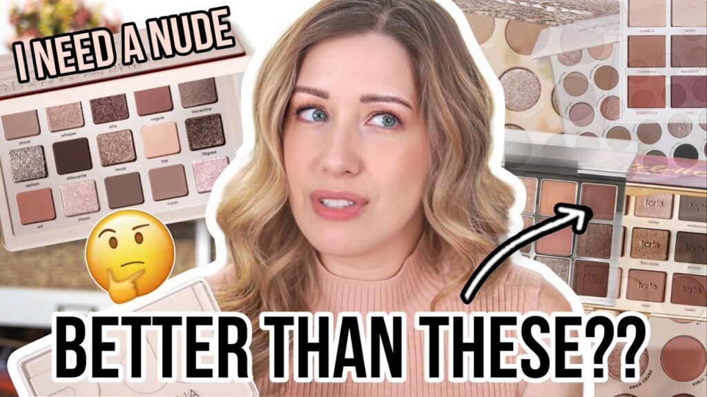
Natasha Denona Palette Review: Exploring the Shades
The Natasha Denona palette has been creating quite a buzz in the beauty community. With its range of warm golds and browns, it seems to be a must-have for many makeup enthusiasts. But does it really live up to the hype?
Warm vs. Cool: A Palette of Contrasts
Upon closer inspection, it becomes evident that this palette offers more than just warm shades. The inclusion of cooler tones, especially in the shimmers, adds a touch of versatility. A silver, a gray, and a soft light pink add dimension and intrigue. It seems like I need a nude, a warmer palette overall, could be rivalled by the cooler and more diverse shades of the Glam palette.
Comparing with Colourpop Palettes
To gain a better understanding of the Natasha Denona palette, it’s interesting to compare it with some popular Colourpop options. One such palette, “That’s Taupe,” showcases a range of cooler taupes and browns, but lacks the rosy and peachy shades present in I need a nude. Despite some overlap in shades, That’s Taupe creates a cooler overall effect, possibly due to the absence of warmer browns and the peachy shade found in I need a nude.
Another noteworthy comparison is the “Going Coconuts” palette from Colourpop. As I examined them side by side, I couldn’t help but notice the striking similarity between these two palettes. In fact, Going Coconuts almost appears to be a condensed version of I need a nude, boasting a remarkably similar range of shades.
The Perplexing Similarities
The striking similarities between these palettes leave one wondering: do we really need another nude palette when there are already so many options available? While the Natasha Denona palette does offer a dynamic mix of warm and cool tones, it begs the question of whether it truly brings something unique to the table. Moreover, with alternatives like Going Coconuts providing a nearly identical color story at a more affordable price point, one can’t help but feel perplexed by the need for another nude palette.
The Natasha Denona palette certainly has its merits. The inclusion of both warm and cool shades adds versatility, and the quality of the shadows is undoubtedly impressive. However, in a market saturated with similar options, it’s essential to question whether the latest nude palette is a necessity or merely another addition to an already extensive collection.
Comparing Shades: Nude Mini vs Going Coconuts
When it comes to the Natasha Denona Nude Mini palette, many makeup enthusiasts have questioned whether they really need it. Upon swatching the shades, one might notice that they appear quite similar to the tones found in the Going Coconuts palette. So, if you already own the latter, it’s safe to say that you probably don’t need the former. However, if you’re looking for a slightly expanded version of Going Coconuts with additional shades, then the Nude Mini might be worth considering.
An Alternative: Comparing Nude Mini and Of Quartz
For those who are on the lookout for a neutral palette, ColourPop’s Of Quartz is another option to consider. While it does possess a mix of warm and cool shades, what sets it apart from the Nude Mini is the presence of deeper, smokier navy and gray shades. Upon examining the swatches, it’s clear that Of Quartz is not as similar to the Nude Mini as Going Coconuts or That’s Taupe. Therefore, if you were considering the Nude Mini, you can essentially cross Of Quartz off your list.
A Budget-Friendly Option: ColourPop Stone Cold Fox
Now, let’s talk about the highly requested ColourPop Stone Cold Fox palette. As one of my personal favorite neutral palettes, it offers a variety of shades that are not found in the Nude Mini palette. While Stone Cold Fox does include some grays and silvers that differ from the Nude Mini, it also features several colors that are remarkably similar. After swatching various shades, I found around 15 shades in Stone Cold Fox that closely resemble those in the Nude Mini. Although they may not be exact matches in some instances, this alternative palette could be an excellent choice if you already own the Nude Mini or are simply looking to save a little money.
And there you have it a breakdown of the Nude Mini palette and its potential alternatives. Hopefully, this review has provided some insight into whether you really need a nude palette in the form of the Natasha Denona Nude Mini. Whether you choose to invest in it or explore the alternative options mentioned, the choice ultimately lies in your hands. Enjoy experimenting and creating stunning looks with whichever palette you decide to go with!
Natasha Denona Palette Review: Comparisons and Swatches
Colourpop Bare Necessities Palette
When looking for a Nude palette, I decided to compare Natasha Denona’s “I Need a Nude” palette to Colourpop’s “Bare Necessities” palette. While both palettes have warm tones, I noticed that “I Need a Nude” had a few warm shades that closely resembled the Bare Necessities palette. However, overall, the Bare Necessities palette appeared to be slightly warmer than “I Need a Nude.” For a better match and alternative, I found that “Stone Cold Fox” was a more suitable option.
Makeup by Mario Ethereal Eyes Palette
The Makeup by Mario “Ethereal Eyes” palette quickly sold out, and unfortunately, it never restocked. I was pleasantly surprised to find that “I Need a Nude” had similar shades when compared swatch by swatch. Both palettes had neutral browns, grays, and peachy pink shades. However, the warm shades in the Mario palette stood out, which are also present in “I Need a Nude.” The only significant difference is the matte gray shade, which is cool toned, that is present in “I Need a Nude.” Therefore, if you missed out on the Mario palette, “I Need a Nude” would be a great choice to achieve similar vibes with the added bonus of cool tones.
Moiras Endless Moonlight Palette
Now let’s take a look at “I Need a Nude” compared to Moira’s “Endless Moonlight” palette.
The Comparison with Moira Palette
I love Moyers eyeshadows so much, and this one contains a mix of both warm and cool nude Shades as well. So I kind of wanted to see how similar they could be. The biggest difference that jumps out at me, right away, is that the Moira palette has those really deep, Grays and Silvers on the bottom row and swatched out. It is a lot more cool tone than I need nude. I think the Grays are more blue based, while the Natasha Denona Grays are a little bit more brownish. So I really wouldn’t say that these are super similar.
Comparison with Tarte Tartelet and Bloom
Next up, let’s look at it next to the tarte tartelet and Bloom, one of my all-time favorite nude palettes. At first glance, I see a lot of similarity between them, but also the tarte palette on the right side. It has those three really deep Shades, while the I need nude only has one and the rest is a bit lighter and softer. So I kind of felt the same way when I saw these swatched out. If I cover up the tarte swatches on the left-hand side, I think, like the right hand, swatches look similar, but when you piece it all together, I do think that tartlett and Bloom just has a lot more depth to it. So they’re not as similar as I thought they might be.
Comparison with Persona Identity Palette
Next up, we have the Persona identity palette. This is another huge favorite of mine, both in terms of the formula and the gorgeous neutral Shades. The biggest difference that I spotted right away,
The Persona Palette
Just looking side by side is the green Shimmer that the Persona has as well as the brighter yellow gold, but other than that it seems like it kind of has a similar undertone. So in a Swatch I do again see some very similar Shades, but also others that stand out, especially the two that I mentioned, the green and the gold.
The Dominique Essentials Palette
Last but not least, we have the Dominique Essentials palette, which I got a few months ago. This one also has a lot of the same tones with the exception of the matte black and the lavender Shimmer shade. It also is mostly warm toned. It doesnt have the grayish taupe Shades that I need a nude has and when youre looking at the swatches, I think the Dominique palette has a bit more depth in the shades and theyre a little bit warmer overall, but there are also some similar Shades at the Same time like the dusty, pink and some of the lighter shimmers, so again not a perfect dupe, but might have a little bit of the same Vibe going on.
Comparing Formulas
So overall, I do have some palettes in my collection already that are very, very similar, especially when it Comes to colourpop, and I know every time I do these comparisons. I always get some comments saying that nothing else is going to compare to Natashas formula and that I shouldnt even compare it to Brands like colourpop but from my perspective Im, not really comparing formulas as much as I am comparing the color stories and, in my mind, Im thinking can you get similar, looks out of the dupe palettes.
Natasha Denona Palette Formula
I honestly don’t think that any of the palettes that I showed as comparison sins have a bad formula. Necessarily, I think you can still get wonderful looks out of all the ones that I showed and even though I do like Natasha’s formula, that doesn’t mean that I can’t, like others as well, just as much maybe for different reasons.
Natasha Denona’s formula is highly pigmented. Sometimes it takes me a little bit longer to blend out, whereas Colourpop is a little bit less so, and I have an easier time working with those. So sometimes I actually prefer Colourpop. Sometimes I prefer a formula like Tarte or Makeup by Mario, which are super soft. It really just depends on the day and what I feel like using, but I honestly don’t think that any of these formulas are bad, so I just wanted to put that out there as well.
The Look Using Natasha Denona Palette
Moving on, I just want to quickly show you how I got the look that I’m wearing today. Starting out with the Natasha Denona palette, I picked up the shade “Wit” on a fluffy crease brush. This is that really light, peachy color and I just started in my crease and blended this one all the way up to my brow bone. Again, Natasha’s formula is very pigmented. A little bit goes a long way. It has that sort of thicker velvety feel and it’s also very soft. I found that I didn’t have to dip back into the palette over and over again.
First Impressions
I managed to get my hands on the coveted Natasha Denona palette, and I couldn’t wait to dissect its shades. My excitement was palpable as I opened the packaging and observed the mesmerizing colors before me. The first shade that caught my attention was a stunning nude.
A Surprising Sheerness
Eager to explore the pigment, I gently applied the nude shade to my lid. To my surprise, one application was enough to achieve the desired effect. The nude hue effortlessly enhanced the natural beauty of my eyes, causing them to pop. It was a subtle touch, yet undeniably impactful.
Aiming to add depth and dimension to my eye look, I opted for the dusty rose matte shade called “Vague.” Upon initial application, I noted that it appeared slightly sheerer than anticipated. Hence, I had to go back and carefully build up the color for the desired intensity. Concentrating on my crease and outer corner, I gradually blended the hue towards the center of my lid. The end result was a charming gradient effect that added an alluring touch to my overall makeup.
The Showstopper
Moving on to the centerpiece of the palette, the shade “Muse” captivated me with its foiled, metallic gold allure. Eager to make the most of its sparkle, I primed my lids with NYX glitter glue to prevent any fallout. Using my finger, I gently patted the shade onto the glue, and the impact was undeniable. The combination of glitter and pigment created a mesmerizing effect that instantly transformed my eye makeup. This shade was no mere topper; it had the power to steal the show. While some toppers are often subtle and light, “Muse” was a force to reckon with, commanding attention with its luminosity.
A Final
The Natasha Denona palette proved to be a versatile and captivating addition to my beauty arsenal. From the subtle elegance of the nude hue to the dazzling allure of “Muse,” this palette offers a range of possibilities for both understated and bold eye looks. While the sheer texture of “Vague” may require a bit more effort to build up, the stunning end result is well worth it. So, do you really need a nude? After experiencing the transformative power of the Natasha Denona palette, the answer is undoubtedly yes.
The Hourglass unlocked mascara
I just finished off with The Hourglass unlocked mascara. This is a tubing formula that I wasn’t crazy about when I first bought it, but I am just obsessed with it now. I use it every single day and I love how long and voluminous this makes my lashes. And also because it’s a tubing formula, it comes off really, really easy. So I love this.
The cheeky blush duo
For blush, I decided to use the give feeling cheeky blush duo in the shade Stars aligned. I love this one as well because it gives you kind of like a nude, almost terra cotta shade on the bottom, which is matte, and then a peachy shade that has just the slightest bit of glow to it. It’s not glittery at all. It just gives your cheeks this beautiful, subtle sheen. I usually just mix the two shades together and apply them with a blush brush. I felt like this duo would just be the perfect complement with the peachy eye look.
The Cali Ray lip and cheek hydrating soft stain
On my lips today, I’m wearing this new one from Cali Ray. This is the super bloom lip and cheek hydrating soft stain. I got this last week and I’ve been wearing it. I got another color too and I’ve been wearing both of them like every single day. They’re so amazing on cheeks and also on your lips as well because they’re a stain. The color lasts such a long time, but it also doesn’t dry out your lips like a normal stain would. It has a little bit of like a balmy texture to it. Like I said, I’ve been using these every single day and I’ve really been loving them.
Shimmer Shades: Toppers or Pigmented?
In this review of the Natasha Denona Palette, let’s delve into the world of shimmer shades. While some may adore the toppers found in this palette, I can’t help but feel a tad perplexed. Don’t get me wrong, I appreciate the concept of toppers in makeup, but they don’t always fulfill my desires. Personally, I prefer shimmer shades with a tad more pigment, ones that offer a metallic or satin finish without being too overpowering. Unfortunately, this palette seems to be divided between these two categories.
The “Wash of Glitter”
When it comes to a shimmer shade, I yearn for a smooth application and a breathtaking glow. However, half of the shades in this palette fall under the category of toppers, leaving them with a rather lackluster effect. These toppers merely offer a wash of glitter, which is not my go-to choice for creating eye-catching looks. Sure, there may be individuals who appreciate the subtlety of these shades, but I find myself searching for something more.
Matte Shades: Dj vu
As for the matte shades, I can’t help but feel a slight sense of dj vu. While they are undoubtedly nice, I can’t ignore the fact that I already own similar matte shades in numerous other palettes. It’s always disheartening to invest in a product only to find out that you already have something quite similar in your collection. Perhaps if there were some standout shimmer shades in this palette, ones that effortlessly blend onto the eyelid, it would have truly captured my attention.
Natasha Denona vs. Colourpop
When comparing the shimmer shades between the Natasha Denona Palette and the Colourpop Stone Cold Fox Palette, the latter takes the lead in my book. The shimmers in the Colourpop palette offer a smoothness and radiance that truly enhance the eye. Even the Going Coconuts palette by Colourpop boasts similar matte shades, making it a more enticing option for those seeking variety.
The Palette Comparison
So if I put this palette and the Stone Cold Fox side by side on my bathroom counter, I can imagine walking in there and selecting Stone Cold Fox over this one, pretty much every single time, not saying that this is a bad palette. Its fine but like I said, I think, because most of the shimmers have like glitter in the formula and I dont wear glitter on a daily basis.
Shimmer Shades Preference
Just once in a while, I feel like the Stone Cold Fox palette would just have more to choose from when it comes to Shimmer Shades.
Nothing New or Exciting
So anyway, thats my take on this palette. I just dont feel like it offers me anything new or anything exciting.
Seeking Opinions
So I would love to hear your thoughts on this down below. Did you buy this? Do you like it? Do you love it? Id love to hear your thoughts on how youre using it, maybe itll inspire me to try something different than I already have with this palette? But let me know down in the comments below.
Gratitude and Recommendation
I just want to thank all of you guys so much for watching todays video. I really truly appreciate it if you have extra time and youd like to watch more of my makeup reviews that are not sponsored. Be sure to click right up here, Im just going to pop a playlist there of some of my recent videos and if you havent, subscribed yet be sure to hit the Subscribe button as well.
About the Palette
As makeup enthusiasts, we are constantly bombarded with the latest releases and buzz-worthy products. One brand that always manages to create a stir in the beauty community is Natasha Denona. Known for their luxurious eyeshadow palettes, the brand recently launched a new addition to their lineup: the “Nude” palette.
This palette, as the name suggests, features a range of nude shades in an array of finishes. From matte to shimmer, it promises to be the ultimate go-to for creating versatile and timeless eye looks. But the question remains, do we really need another nude palette in our collection?
The Packaging
Let’s start with the packaging. As expected from Natasha Denona, the Nude palette comes in a sleek and elegant compact. The packaging is simple yet sophisticated, with a sturdy feel that exudes luxury. Opening the palette reveals a full-size mirror, perfect for on-the-go touch-ups.
However, when it comes to packaging, it’s important to remember that the true value lies in the product itself. So, let’s dive into the shades and their performance.
The Shade Selection
The Nude palette offers a well-curated selection of shades that range from warm to cool tones, ensuring there is something for everyone. From soft beiges and warm browns to sultry taupes and deep charcoals, this palette covers all bases. The inclusion of both matte and shimmer finishes allows for endless possibilities.
Each shade is formulated to be highly pigmented, ensuring effortless color payoff with every application. While some may argue that there are similar shades in other nude palettes on the market, Natasha Denona has managed to create a cohesive and versatile range that sets it apart from the rest.
The Formula
Now, let’s talk about the formula. Natasha Denona is known for its high-quality eyeshadows, and the Nude palette is no exception. The shadows are buttery smooth and blend like a dream, making it easy to create seamless eye looks. The pigmentation is intense, allowing for both soft, everyday looks and bold, glam statements.
In terms of longevity, these eyeshadows hold up remarkably well. Whether you’re wearing them for a few hours or a full day, you can trust that your eye look will stay intact. The shadows don’t crease or fade, giving you confidence in your makeup all day long.
After thoroughly exploring the Need a Nude palette, I can confidently say that it offers a unique and worthwhile addition to any makeup lover’s arsenal. Despite initial reservations about yet another nude palette, its balanced and well-curated shade selection along with its exceptional formula make it a standout choice. While it may not be an absolute necessity for everyone, it certainly brings something special to the table, making it a tempting palette for both beginners and experienced makeup enthusiasts alike.
And there you have it, a detailed review of the Natasha Denona Need a Nude palette. Whether you’re a fan of nude shades or simply looking to expand your collection, this palette is definitely worth considering.
Just to wrap everything up. The Hourglass unlocked mascara, the cheeky blush duo, and the Cali Ray lip and cheek hydrating soft stain have become an essential part of my daily makeup routine. They each bring something unique and beautiful to my overall look. I can confidently say that I really need these products in my life.
The Natasha Denona Palette is a nice addition to any collection, but it may not necessarily be a must-have. While some may revel in the toppers and appreciate the matte shades, I can’t help but feel a sense of familiarity and yearning for more pigmentation and smooth shimmer shades. It all boils down to personal preferences and whether you feel this palette offers something unique and essential for your makeup routine. But for me, the search for the perfect nude palette continues.
We’ve explored the packaging, shade selection, and formula of the Nude palette. Let’s now consider whether we really need it.
With so many nude eyeshadow palettes available, it’s easy to question the necessity of adding yet another one to your collection. However, the Natasha Denona Nude palette brings a level of quality and versatility that sets it apart.
If you’re a makeup lover who enjoys experimenting with nude shades and wants a palette that delivers exceptional pigmentation and blendability, then this palette is a worthy investment. It’s a versatile option that can take you from day to night effortlessly.
However, if you already own multiple nude palettes and find yourself reaching for them less frequently, it may be wise to evaluate whether the Nude palette would truly enhance